The History and Power of Candlesticks in Trading
Unveiling the Power of Candlestick Charts: A Trader’s Guide
Candlestick charts are a cornerstone of technical analysis, providing traders with a visual representation of price movements. But where did this powerful tool originate, and how can you leverage it to improve your trading strategies? This article will delve into the history and basics of candlestick charting, offering insights and practical knowledge to enhance your market analysis.
The Origin of Candlesticks: A Japanese Rice Trader’s Innovation
The story begins in 18th-century Japan with Munehisa Homma, a rice trader often hailed as the father of candlestick charting. Homma devised a method to visually represent price movements over time. This innovation allowed traders to track the opening, closing, high, and low prices for a specific period, displayed in a simple, digestible format. Homma’s groundbreaking work laid the foundation for modern technical analysis, providing a potent tool to predict future price actions through identifying patterns.
Why Candlesticks Gained Popularity
Candlestick charts rapidly gained popularity for their clear visual representation of price movements. Traders could easily identify patterns, anticipating potential market trends. This visual clarity is a significant advantage, simplifying the often-complex world of financial markets.
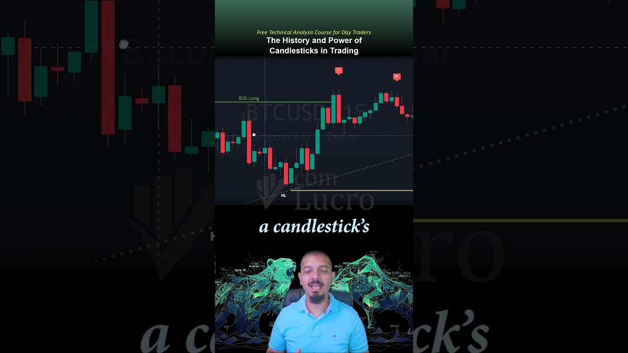
Candlesticks: A Snapshot of Market Sentiment
Candlesticks offer a detailed snapshot of market sentiment during a specific timeframe. They are invaluable for identifying patterns and potential trading opportunities. By examining a candlestick’s shape and size, traders can glean insights into the ongoing battle between buyers and sellers, assess market momentum, and anticipate potential reversals.
Understanding the Anatomy of a Candlestick
Each candlestick represents the price movement of an asset over a particular period. For example, on a daily chart, one candlestick represents one full day of price action. Candlesticks simplify analysis by offering a clear visual representation of market behavior during that time.
A candlestick has two main parts: the body and the wicks (or shadows). The body represents the range between the opening and closing prices. The wicks, or shadows, show how high or low the price moved during that period. These components are crucial for interpreting price action.
Bullish vs. Bearish Candlesticks: Interpreting Color
On a chart, you’ll typically see two types of candles: green (or bullish) and red (or bearish). A green candle forms when the closing price is higher than the opening price, indicating that buyers were more dominant than sellers during that session. Conversely, a red candle forms when the closing price is lower than the opening price, indicating that sellers were dominant.
Elevate Your Trading with Candlestick Analysis
Understanding candlestick charts is an essential skill for any trader or investor. They provide valuable insights into market sentiment, potential trends, and reversal points.
Ready to take your trading to the next level? Watch the full video to deepen your knowledge of candlestick patterns and learn how to apply them to your trading strategies. Don’t miss out on this opportunity to enhance your market analysis skills!
Key Takeaways from the Video:
- Learn the history of candlestick charting and the role of Munehisa Homma.
- Understand the components of a candlestick: body and wicks.
- Differentiate between bullish and bearish candlesticks and what they indicate.
- Discover how to use candlestick patterns to identify potential trading opportunities.
This video is packed with information that can help you make more informed trading decisions. Invest the time to watch it and elevate your trading game!
