The History and Power of Candlesticks in Trading
🕯️ Candlestick Charts: The Visual Language of Financial Markets
Did you know that candlestick charting originated in 18th-century Japan? Developed by legendary rice trader Munehisa Homma, this technique laid the foundation for modern technical analysis.
In this episode from our Technical Analysis for Day Traders course, we’ll walk you through the basics of candlestick charts — what they are, how they work, and why they’re essential for traders.
You’ll learn: ✅ The origin of candlestick charts
✅ How each candle reveals market sentiment
✅ The difference between bullish and bearish candles
✅ How to use candle patterns to identify trade opportunities
Candlestick charts are more than just visuals — they offer deep insight into market psychology. Whether you’re new to trading or refining your edge, this is a must-watch!
📺 Watch the full video now and take your trading skills to the next level.
🌐 Com Lucro – https://www.comlucro.com.br/
📺 YouTube – Com Lucro – https://comlucro.com.br/youtube
📈 TradingView – https://www.tradingview.com/?aff_id=119375
#CandlestickCharts #TechnicalAnalysis #TradingBasics #PriceAction #DayTrading #MunehisaHomma #ChartPatterns #BullishCandle #BearishCandle #MarketPsychology #TradingEducation
00:00:00,240 --> 00:00:04,720
Candlestick charting originated in Japan
in the 18th century and was developed by a
00:00:04,720 --> 00:00:10,480
Japanese rice trader named Munehisa Homma, often
credited as the father of candlestick charting,
00:00:10,480 --> 00:00:15,600
Munehisa Homma introduced a method that
visually represented price movements over time,
00:00:15,600 --> 00:00:20,720
with each candlestick displaying the
opening, closing, high, and low prices
00:00:20,720 --> 00:00:25,760
for a specific period. His work laid the
foundation for modern technical analysis,
00:00:25,760 --> 00:00:31,120
offering traders a powerful tool to predict
future price movements through patterns.
00:00:31,120 --> 00:00:34,640
Candlestick charts became popular not
only because they provided a clear
00:00:34,640 --> 00:00:38,800
visual representation of price movements, but
also because they allowed traders to identify
00:00:38,800 --> 00:00:43,520
patterns that helped anticipate potential market
trends. Now that we understand the history,
00:00:43,520 --> 00:00:47,120
let’s move on to the basics.
What exactly are candlesticks?
00:00:47,120 --> 00:00:52,160
Candlesticks are one of the most popular methods
used by traders to visualize price movements.
00:00:52,160 --> 00:00:56,240
They offer a detailed snapshot of market
sentiment during a specific time period,
00:00:56,240 --> 00:01:01,600
and are essential for identifying patterns and
potential trade opportunities. By examining
00:01:01,600 --> 00:01:06,160
a candlestick’s shape and size, traders can
gain insights into the ongoing battle between
00:01:06,160 --> 00:01:11,120
buyers and sellers, momentum, and potential
reversals. Each candlestick represents the
00:01:11,120 --> 00:01:14,960
price movement of the asset over
a particular period. For example,
00:01:14,960 --> 00:01:19,600
on a daily chart, a single candle
represents one full day of price action.
00:01:19,600 --> 00:01:24,320
Candlesticks simplify the analysis process by
providing a clear visual representation of market
00:01:24,320 --> 00:01:29,600
behavior during that time. So what exactly does
a candlestick look like? A candlestick consists
00:01:29,600 --> 00:01:34,960
of two main parts: the body and the wicks
or shadows. These components are critical
00:01:34,960 --> 00:01:39,920
for interpreting price action. The body represents
the range between the opening and closing prices,
00:01:39,920 --> 00:01:43,840
while the wicks show how high or low
the price moved during that time.
00:01:43,840 --> 00:01:48,400
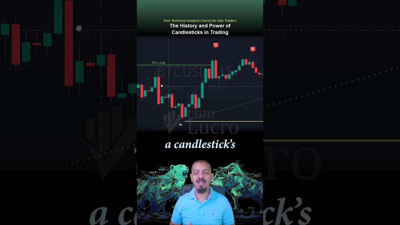
On the chart, you’ll typically see two
types of candles: green or bullish candles,
00:01:48,400 --> 00:01:52,720
and red or bearish candles. A green candle
forms when the closing price is higher than
00:01:52,720 --> 00:01:57,200
the opening price, indicating that
buyers outpaced sellers. Similarly,
00:01:57,200 --> 00:02:01,600
a red candle forms when the closing
price is lower than the opening price,
00:02:01,600 --> 00:02:05,440
showing that sellers dominated during
that session. So if you’re ready to deepen
00:02:05,440 --> 00:02:08,400
your knowledge and elevate your trading,
don’t miss the full video on our channel.
00:02:08,400 --> 00:02:08,960
Watch now!!!
Perguntas Respondidas por esse Artigo
-
Qual a origem dos gráficos de candlestick?
-
O que os gráficos de candlestick revelam sobre o mercado?
-
Qual a diferença entre candles de alta (bullish) e candles de baixa (bearish)?
-
Como os padrões de candlestick podem ser usados no trading?
-
Por que os gráficos de candlestick são importantes para traders?
